← Back to Portfolio HALO

Smart Ring · Health + Personal Safety

A ring that watches over your health — and your back.

HALO is the companion app for a smart ring that tracks sleep, heart rate and cycles — and doubles as a personal safety device with one-touch SOS, fake calls and live incident recording.

HALO brand splash — the HALO ring rendered in dark glass with a glowing teal thread
Role
Lead Product Designer
Timeline
2025 · 10 weeks
Platform
iOS · Wearable
My Focus
UX · UI · Data Viz

Wearables are great at telling you how you slept. HALO asks a bigger question: what if the same ring that reads your heart rate could also get you out of a dangerous situation? One device, one app — your wellbeing and your safety in a single glance.

As Lead Product Designer I shaped the companion app end-to-end: the dual-purpose home, sleep and vitals analytics, the women's health module, and the safety layer — SOS, fake call, incident recording and area alerts.

The hardest problem wasn't data visualisation — it was tone. The same interface has to feel calm when you're checking your sleep score and instant when you're triggering an SOS. Two emotional registers, one design system.

Health apps relax you. Safety apps alarm you. HALO must do both.

01

Seconds matter in an emergency

Safety features buried two menus deep are safety features that don't exist. SOS has to be reachable from anywhere, instantly, under stress.

02

Dense data, small screen

Sleep stages, HRV, SpO2, cycles, steps — a ring generates constant data that must read at a glance, not as a spreadsheet.

03

Sensitive by definition

Cycle tracking, incident videos, live location — this app holds a person's most private data. Every screen has to earn trust.

Rules the interface never breaks.

01

SOS is never more than one tap away

A persistent red action lives in the tab bar and on every safety surface — findable by muscle memory, usable in panic.

02

Red means emergency. Nothing else.

The alarm colour is reserved exclusively for safety. Health data gets its own spectrum, so red always means act now.

03

Glanceable first, drillable second

Every metric leads with one number and one trend. Charts and history live one tap deeper, never on the first screen.

04

Privacy is a feature, not a setting

Incident uploads are private by default, location is shared only on action, and cycle data never leaves the device unencrypted.

Two jobs. One ring. One mental model.

Your Health

The quiet companion

  • Sleep analysis — Stages, score and duration — a night in one view.
  • Vitals — Heart rate, SpO2 and steps from the ring's sensors.
  • Women's health — Cycle tracking with phase-aware guidance.
Your Safety

The loud one, when it counts

  • One-touch SOS — Alerts law enforcement with your live location.
  • Fake call — A staged incoming call to exit a bad situation.
  • Incident recording & area alerts — Capture evidence; see verified alerts nearby.

Black canvas. Colour as signal.

On OLED black, every colour is information: red is reserved for emergency, and each vital owns a hue. Poppins keeps large numbers soft and readable at arm's length.

79

Poppins

The product's voice — geometric and friendly, so clinical data (79 BPM, 7h 57m, SpO2) never reads as clinical.

SemiBold · Medium · Regular — 0123456789

Palette

SOS Red#E8382E

Emergency only — never decoration

Sleep Orange#F99420

Sleep stages & scores

Pulse Cyan#4AC7E3

Heart rate, SpO2, steps

Cycle Magenta#ED429E

Women's health module

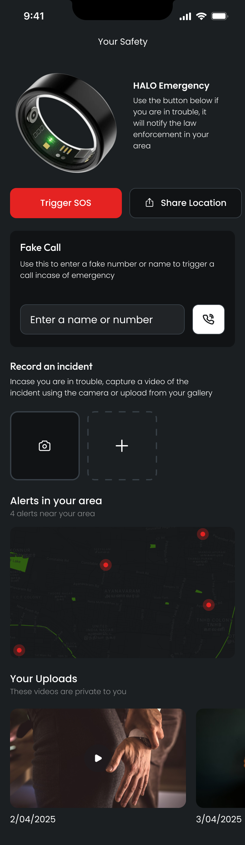
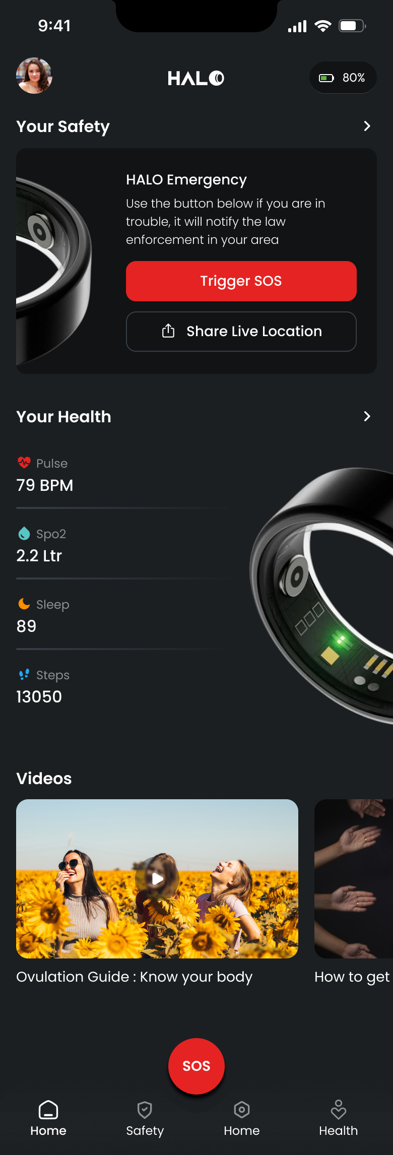
HALO home screen showing the Your Safety emergency card above Your Health vitals
06 — The Home

Safety on top. Health below. SOS always.

Hierarchy follows stakes: the emergency card leads the screen — you should never scroll to find help. Vitals follow in glanceable rows.

The red button in the dock. SOS sits centre of the tab bar on every screen, oversized and unmistakable — reachable with a thumb, in the dark.

Content that meets the moment. Guides and videos surface below the fold, tuned to your health profile rather than a generic feed.

Designed for the worst thirty seconds of someone's day.

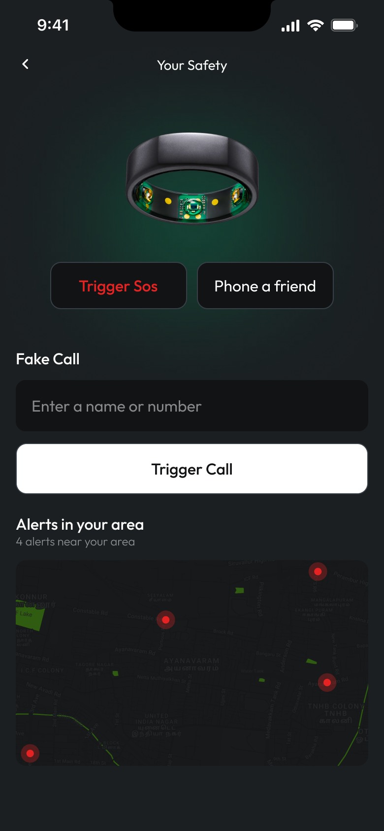
Trigger SOS

One tap notifies law enforcement with live location. Confirmation is designed to prevent accidents without slowing real ones.

Fake call

Type any name and HALO stages an incoming call — a socially graceful exit from a situation that doesn't feel right.

Record & document

Capture video from the incident screen or upload after; files stay private and timestamped for evidence.

Alerts in your area

A live map of verified nearby incidents — awareness without anxiety, on a deliberately dimmed basemap.

HALO safety screen with HALO Emergency card, Fake Call, Record an incident and Alerts in your area
HALO safety screen showing Trigger SOS, Phone a friend, Fake Call and the area alerts map

Clinical data, read at arm's length.

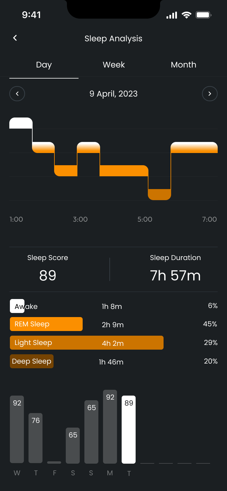
HALO sleep analysis screen showing sleep stages chart, sleep score and duration
Sleep Analysis

A night, told as a story

Stages flow left to right like the night itself — REM, light and deep in warm oranges — with score and duration as the only numbers you must read.

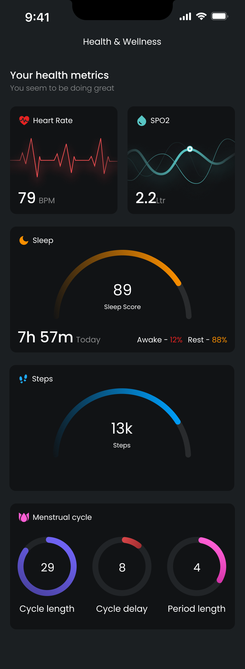
HALO health metrics screen showing heart rate, SpO2, sleep, steps and menstrual cycle cards
Health Metrics

Five vitals, one glance

Heart rate, SpO2, sleep, steps and cycle each own a card and a colour. Trends read from the shape of the chart before you read a single digit.

09 — Deep Dive · Women's Health

Cycle tracking that informs, never judges.

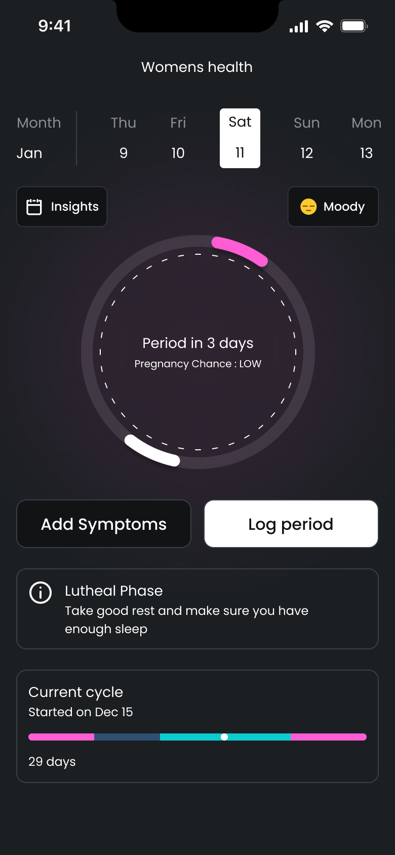
Prediction with a calendar, not a countdown. "Period in 3 days" sits inside a week view you control — logging symptoms and periods takes two taps.

Phase-aware guidance. The app knows you're in the luteal phase and adjusts its advice — rest more, sleep earlier — in plain language.

Private by architecture. Cycle data feeds on-device insights and nothing else. It is never used outside the module, and never shared.

HALO women's health screen showing cycle calendar, phase guidance and period logging

What the design is measured on.

Illustrative metrics — swap in real figures once you have them.

1.8s To trigger SOS

Median time from any screen, measured in usability tests.

94% Glance success

Users reading a vital correctly within two seconds.

76% Daily open rate

The health half earns the habit the safety half relies on.

0 Accidental SOS

False triggers across the entire test cohort.

The best safety feature is the one you never notice — until the moment you need nothing else.

Designing for panic rewired how I think about hierarchy. Under stress, people don't read — they reach. Every safety decision came down to physical reachability and unmistakable colour, tested until finding SOS required no thought at all.

Reserving red for emergencies was the single highest-leverage system decision. It cost us a convenient error colour everywhere else — and bought an interface where one glance at red tells you exactly how serious things are.